The Psychology of Colour in the Home

Colour changes a room long before furniture is arranged or pictures are hung.

A soft green kitchen can feel calm and grounding even on busy mornings. A deep blue bedroom seems to quiet the mind as evening falls. Warm earthy tones wrap a living room in comfort during winter afternoons, while pale neutrals allow light to drift gently across walls throughout the day. Often, people respond emotionally to colour before they fully realise why.

Perhaps that is because colour is never simply decorative.

It shapes atmosphere, influences mood and quietly alters how we experience the spaces around us. Across historic homes, cottages and interiors throughout Britain, colour has long been used not only for beauty, but for feeling. Rooms were designed to feel warm against cold weather, restful beneath candlelight or uplifting during darker months.

Today, although trends continue to evolve, the emotional power of colour remains remarkably unchanged.

The colours we surround ourselves with influence how a home feels to live in.

And increasingly, people are choosing palettes not simply because they are fashionable, but because they support the kind of atmosphere they wish to create.

In kitchens, colour often shapes energy and sociability more than any other room in the house.

Traditionally, kitchens were the heart of daily life — warm, active spaces filled with movement, conversation and food. Colours inspired by nature continue to work beautifully here because they create warmth without overwhelming the senses. Sage greens, muted creams, soft clay tones and weathered blues all feel welcoming and timeless.

Green in particular carries a calming quality closely connected to the natural world. It softens busy kitchens and creates freshness without becoming cold. Warm whites and oat shades help smaller kitchens feel airy while still retaining comfort, particularly in homes where natural light changes dramatically throughout the seasons.

Deeper colours can work beautifully too when balanced carefully. Navy cabinetry against brass fittings creates richness and depth, while charcoal tones paired with natural wood feel grounded and sophisticated.

Bedrooms respond differently to colour because they are spaces designed for rest and retreat.

Soft blues remain enduringly popular for good reason. They naturally encourage calm and stillness, echoing sky, sea and evening light. Muted greens bring a restorative quality that feels deeply connected to gardens and landscape beyond the window. Warm taupes, dusky pinks and earthy neutrals create cocooning spaces that feel gentle rather than stark.

Importantly, restful bedrooms rarely rely on harsh contrast. Colours layered tonally together create softness and ease. Linen bedding, painted walls and textured fabrics all contribute to the overall emotional atmosphere of the room.

The goal is not perfection.

It is creating somewhere that allows the mind to settle.

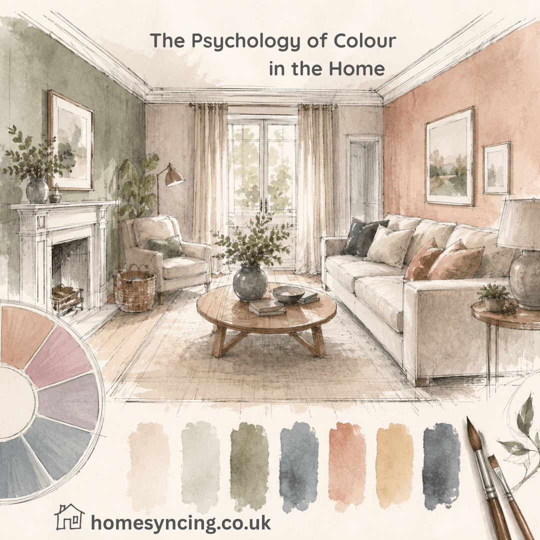
Living rooms often benefit from warmth above all else.

These are spaces where people gather, relax and spend long evenings together, particularly during colder months. Richer colours often work beautifully here because they encourage intimacy and comfort. Olive greens, deep ochres, warm terracottas and smoky blues all create depth without feeling oppressive.

Historically, darker colours were frequently used in drawing rooms and libraries because they responded beautifully to firelight and candlelight. Even today, deeper tones can make living rooms feel wonderfully cocooning in the evenings, especially when paired with layered lighting and natural textures.

At the same time, lighter living rooms can feel equally welcoming when warmth is maintained through texture and material. Stone shades, warm whites and soft sand tones allow natural light to become part of the design itself.

Workspaces require yet another balance entirely.

As more people work from home, the emotional effect of colour within offices and creative spaces has become increasingly important. Colours that are too stimulating can create restlessness, while overly muted rooms may feel uninspiring.

Soft greens and blues often help concentration because they feel calming without becoming sleepy. Earthy neutrals create steadiness and reduce visual distraction. Touches of ochre or terracotta can introduce warmth and creativity without overwhelming a space.

Natural light plays a significant role here too. Colours shift constantly depending upon the time of day, orientation of the room and surrounding landscape. A grey-green may feel cool and crisp in morning light yet warm and enveloping by evening.

This relationship between colour and light is one reason timeless palettes tend to endure.

They evolve beautifully throughout the day rather than appearing flat or static.

There is also growing appreciation for colours that feel rooted in nature itself. Moss greens, chalky whites, clay pinks, weathered blues and earthy browns connect interiors subtly to the outdoors, helping homes feel calmer and more grounded.

Perhaps this explains why heavily trend-led colours often date more quickly. They can feel disconnected from the rhythms of natural light and daily life, whereas nature-inspired palettes tend to sit comfortably within homes for years.

And ultimately, colour is deeply personal.

What feels calming to one person may feel cold to another. Some people crave airy simplicity, while others feel safest surrounded by rich, cocooning tones. The most successful interiors are rarely those following trends exactly, but those that reflect how people genuinely wish to feel within their homes.

Because colour is not simply something we see.

It is something we experience.

It shapes the atmosphere of rainy mornings and candlelit evenings. It softens busy kitchens, quietens bedrooms and brings warmth to gathering spaces. It influences how a room holds light, comfort and emotion throughout the changing seasons.

And often, the right colour can quietly transform not only a room, but the way life unfolds within it.

Further Reading: Affordable Decorating Ideas That Will Transform Your HomeSustainable Chic: A Beginner’s Guide to Circular DesignSmall Room, Big Impact

Daily Inspiration: Follow Us on Instagram, BlueSkyThreads , PinterestTwitterTikTok


Interior Design Trends for 2025

Looking to refresh your space in 2025? You’re in luck! While interior design is all about creating a space that feels personal and functional, keeping an eye on trends can inspire some stunning updates to your home. And in 2025, design is taking an exciting turn—and it’s all about bold creativity, storytelling and connection to nature.  

From earthy tones to statement wallpapers, 2025’s interior trends balance elegance and functionality while welcoming a renewed sense of individuality. Whether you’re a design enthusiast, a homeowner dreaming of a refresh, or a professional looking to introduce clients to the next big thing, this guide has you covered.  

Expect a year where colours make a splash, materials mix seamlessly and hidden surprises—quite literally—add intrigue to your living spaces. Here’s a deep dive into the top trends for 2025 and why you’ll fall in love with them.  

Colour Drenching

What to Expect in 2025 Interior Design  

The overarching theme for 2025 interiors is finesse with boldness. Elements traditionally seen as subtle take centre stage, while timeless classics are reimagined through contemporary lenses. It’s a year of thoughtfully-crafted layers, where aesthetics meet sustainability and functional design evolves with flair.  

Think vibrant colours that don’t shy away, natural textures and a revival of some unexpected materials. But it’s not just about the trends themselves—it’s how they enhance the way we live, ensuring spaces feel personal, multifunctional and authentic. Now, let’s explore the show-stopping trends that will dominate homes in 2025.  

1. Colour Drenching  

If minimalism left rooms feeling too sparse, colour drenching is here to counterbalance like never before. This trend takes a single hue and applies it across walls, ceilings, woodwork and even furniture to create a monochromatic masterpiece.  

Why it works so well: 

  • It creates a cohesive, enveloping vibe in a room, ideal for spaces like dining rooms or studies.  
  • Bold colour choices like cobalt blue or deep green are making waves, transforming spaces into statement areas without looking overwhelming.  
  • For a softer approach, muted pastels such as terracotta or sage green might be your go-to.  

Why you’ll love it  

Colour drenching amplifies personality. It adds warmth and depth to forgotten corners while bringing a sense of completeness to your interior. The full-room saturation effect makes your space feel curated and intentional.  

2. Wallpaper Beyond Walls  

When was the last time you looked at a ceiling as a design feature? Wallpaper is stepping off the walls and climbing onto ceilings, doors, furniture and even around staircases. 2025 is the time to get playful with bold patterns and textures.  

Applications we love: 

  • Ceilings packed with floral, abstract or geometric designs to bring unexpected drama.  
  • Cabinet interiors lined with wallpaper to add sophistication when opened.  
  • Pairing bold wallpapers with neutral furniture to balance harmony and impact.  

Why you’ll love it  

Wallpaper transforms mundane spaces into design moments. It offers a simple way to express creativity and the options—ranging from subtle textures to striking prints—make your home feel vibrant and unique.  

3. The Return of Earthy Tones  

Earthy tones like clay, ochre, sandy beige, and mustard yellow are creating a grounding palette this year. Inspired by our desire to reconnect with nature, these hues generate warmth and complement natural materials such as wood and stone.  

Effective use of earthy tones: 

  • Pair a burnt orange sofa with rattan furniture for a cosy, inviting living room.  
  • Use deep, earthy greens to add richness to kitchens or tiled spaces.  
  • Combine beige tones with textured fabrics for a layered, monochromatic look.  

Why you’ll love it  

Earthy tones lend an organic feel to your home. They calm the senses and provide understated charm, effortlessly setting the stage for more playful design accents.  

4. The Rise of Dark Woods  

Light oak and Scandinavian minimalism are giving way to rich, dark woods in 2025. Think walnut, mahogany, and cherry finishes, which add gravitas and elegance to interiors—all while delivering a cosy, heritage-inspired feel.  

Where to see this: 

  • Dining tables, sideboards and even flooring in darker hues to ground your space.  
  • Dark wood doorframes paired with light walls for striking contrast.  
  • Finishings made cohesive with brass or gold hardware.  

Why you’ll love it  

Dark woods are timeless yet modern. They bring luxury into multifunctional spaces, maintaining a balance of refinement and durability.  

5. A Harmony of Mixed Metals  

Gone are the days of sticking to one metal finish. Copper, brushed gold, matte black, and chrome now work together to create dynamic and stylish contrasts in kitchens, bathrooms, and beyond.  

How to master the mix: 

  • Use brushed gold faucets with matte black cabinet handles for a striking look in bathrooms.  
  • Pair rose-gold fixtures with antique brass lighting to soften living areas.  
  • Ground metallic accents with muted tones or natural materials.  

Why you’ll love it  

Mixed metals break traditional design rules with finesse, offering refreshing takes on classic spaces. It’s an easy way to modernise your home in small yet meaningful ways.  

6. The Magic of Hidden Doors  

Cue the drama—the 2025 trend of hidden doors brings mystery and minimalism into the home. Whether it’s a hidden pantry tucked behind a bookshelf or a seamless panel door leading to your study, it blurs functionality with fun.  

Where to use this: 

  • Hidden storage solutions, such as pantry spaces behind decorative cabinetry.  
  • Seamless room dividers that maintain a clean aesthetic.  
  • Secret reading nooks or closets for a touch of whimsy.  

Why you’ll love it  

Hidden doors offer stylish surprises while improving functionality and space optimisation. Everyone wants a bit of enchantment in their home—why not start with something unexpected?  

Transform Your Space with 2025 Trends  

The interior design trends of 2025 combine timeless quality with bold statements and clever updates. Whether you’re embarking on a full remodel or looking for smaller ways to refresh your home, these trends adapt beautifully to every lifestyle.  

Feeling inspired? It’s time to bring these ideas into your own home. Whether it’s through bold colour drenching, dark wood accents or a playful wallpaper ceiling, make 2025 the year where your space reflects your personal style.  

For Daily Inspiration, Follow us on Instagram

Further Reading: Interior Design Trends 2025 – Colour Drenching

Interior Design Trends for 2025 – Colour Drenching  

The world of interior design is buzzing with trends for 2025, but one bold yet captivating concept has our attention—colour drenching. If you’re ready to say goodbye to plain white walls and dip your home in unapologetic swathes of colour, this is the trend for you. It’s vibrant, expressive and brimming with personality.  

But what exactly is colour drenching, and why is it making waves in the design world? This guide will take you through everything you need to know, from its benefits to how to pull it off with confidence.  

Interior Design Trends for 2025

What is Colour Drenching?  

Colour drenching is more than just a fancy term for painting a room—it’s a design revolution. Instead of sticking to one or two colours for your walls and pairing them with neutral tones, colour drenching encourages you to select a single hue and apply it everywhere.  

We’re not just talking walls here. Skirting boards, ceilings, doors and even furniture are painted in the same shade or varying tones of the same colour. The result? A cohesive, enveloping effect that transforms a room into an immersive colour experience.  

Picture a living room awash with deep olive, where every corner cradles you in its earthly warmth. Or a bedroom draped in silky terracotta, offering an inviting cocoon-like atmosphere. That’s the magic of colour drenching—it’s bold yet harmonious, rich yet deliberate.  

What Does Colour Drenching Achieve?  

Colour drenching strikes an exquisite balance between maximalism and minimalism. It creates impact while keeping the design visually calming. Here’s how it transforms a space: 

  • Heightens Mood: Colours hold the power to evoke emotions. Blues calm, yellows energise, greens inspire balance. By fully committing to one hue, you amplify its emotional impact, turning a room into what feels like a sanctuary—or a lively hub.  
  • Adds Depth: The consistent use of one shade creates an illusion of depth. Without visual interruptions from contrasting colours, your space feels larger and more cohesive.  
  • Showcases Personality: Colour drenching shouts “individuality.” Whether you choose moody midnight tones or playful pastels, it’s a bold move that reflects your personal style.  
  • Creates Flow: When done across multiple rooms, colour drenching can create a seamless flow throughout the house, tying your interiors together like a well-curated narrative.  

The Benefits of Colour Drenching  

Beyond its aesthetic appeal, colour drenching offers some rather practical perks too.  

1. A Unified Look in Minutes  

With just one main colour to work with, decision-making becomes much simpler. Forget grappling with colour schemes or balancing contrasting accents—just pick a shade and run with it.  

2. Budget-Friendly Results  

Achieving a high-impact transformation doesn’t have to mean expensive wallpaper or décor. By focusing your efforts on paint, you get a significant change without breaking the bank.  

3. Versatility Across Design Styles  

Whether your style leans Scandinavian simplicity, industrial chic or bohemian flair, colour drenching works with all aesthetics. From soft sage for a minimalist haven to deep aubergine for a dramatic, gothic touch, the choice is yours.  

4. Camouflages Imperfections  

A common designer trick, colour drenching can cleverly hide oddly-shaped nooks, cracks, or less-than-perfect paint jobs. When everything blends, flaws are far less noticeable.  

5. Highly Customisable:  

It’s not just about picking “one colour fits all.” You can interpret colour drenching in your own way—layering tones within the same hue, using textures or incorporating metallic finishes for depth and drama.  

How to Create a Colour Drenched Space  

Now for the fun part—bringing this look to life! Here’s how to approach it step by step.  

Step 1: Choose Your Colour Wisely  

This is the foundation of your colour-drenched space, so spend time considering your choice. Keep in mind factors like: 

  • Mood: Think about the feeling you want to evoke. Warm colours like rust and ochre are energising, while cool tones like navy or mint create tranquillity.  
  • Lighting: Natural and artificial light can drastically alter how a colour looks in a space. Test swatches at different times of the day!  
  • Room Functionality: Soft blush might work beautifully in a bedroom, but you may want a more vibrant green or teal for a creative and collaborative home office.  

Step 2: Plan the Surfaces  

True colour drenching means extending your chosen colour beyond the walls. Decide which additional surfaces will join the party: 

  • Ceilings and skirting boards  
  • Doors and door frames  
  • Shelving and built-in cabinetry  
  • Furniture, like sideboards or even dining chairs  

For those hesitant to paint furniture, try colour-coordinated décor items like cushions, rugs, or throws. This keeps it cohesive without the commitment.  

Step 3: Play with Textures and Finishes  

Just because you’re sticking with one colour doesn’t mean it has to look flat. Experiment with textures and finishes to add dimension: 

  • Pair matte walls with a high-gloss ceiling for a striking contrast.  
  • Use textured fabrics, like velvet or boucle, in the same shade as your walls.  
  • Layer in artwork, vases or ceramics to soften the look.  

Step 4: Test Before You Commit  

Test patch your chosen paint in a small area and live with it for a few days to see how it behaves in different light conditions. Some shades can become overpowering at certain times of the day, so it’s worth experimenting.  

Step 5: Balance with Neutral Touches  

To avoid overwhelming a space, balance your drenched areas with a few neutral accents. Think along the lines of pale wood floors or a natural-toned sofa. This creates breathing room without disrupting the visual impact. 

Step 6: Bring the Room to Life                     

Now that your space is painted and styled, add the final touches. Plants, warm lighting, and personal objects keep it feeling lived-in and welcoming.  

Why You Should Try Colour Drenching in 2025  

Interior design is all about expression, and colour drenching delivers in spades. It’s creative without being complicated, impactful yet timeless, and suits every taste and budget.  

By immersing your space in a palette that resonates with you, you’re not just following a trend—you’re creating a home that feels uniquely yours.  

If you’re excited to make your own space pop with this bold new trend, start exploring paint swatches today. And remember, even small steps—like painting a singular corner or one piece of furniture—can transform your home into a masterpiece.  

Follow us on Instagram for Daily Inspiration

Further Reading: Cosy Bedroom Decor Ideas

Translate »