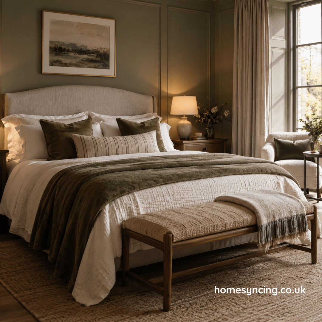
There is a particular moment when you first enter a really lovely hotel bedroom.
The door closes behind you. Your bag is put down. And, before you have inspected the bathroom or discovered where the kettle has been hidden, you notice how the room makes you feel.
Calm.
The bed looks inviting. The lamps cast a gentle glow. There is somewhere sensible to put your coat, somewhere comfortable to sit and, if the room has been particularly well considered, a bedside table large enough for a book, a glass of water and the inevitable collection of things emptied from your pockets at the end of the day.
Nothing feels accidental.
That is the real secret of a boutique-hotel bedroom.
It isn’t necessarily about expensive furniture, enormous beds or crisp white sheets folded with military precision. It is about thoughtfulness. Proportion, texture, lighting and comfort have all been considered together.
And there is no reason that feeling should be reserved for weekends away.
With a few carefully chosen changes, it is entirely possible to create a boutique-hotel bedroom at home — one that feels special when you walk into it, but still feels unmistakably yours.
Begin with the bed
In a good hotel bedroom, there is rarely any doubt about the most important piece of furniture.
The bed takes centre stage.
At home, we sometimes allow wardrobes, chests of drawers and other practical furniture to dominate the bedroom simply because they are large. But if you want to create a hotel-style bedroom, begin by making the bed the visual heart of the room.
Where possible, position it on the wall that feels most natural when you enter.
Then give it presence.
A headboard is one of the simplest ways to do this.
Upholstered headboards bring softness and help absorb sound, while wooden designs introduce warmth and natural character. A taller headboard can create the sense of luxury often associated with boutique hotels, particularly in a room with generous ceiling height.
It doesn’t need to be extravagant.
What matters is that the bed feels anchored rather than simply pushed against a wall.
Choose bedding you actually want to climb into
Hotel beds have an advantage.
You arrive when somebody else has made them.
At home, where the responsibility is rather less conveniently outsourced, it makes sense to keep things beautiful but manageable.
Start with the bedding itself.
Natural, breathable fabrics such as cotton and linen are comfortable against the skin and become softer with use. Choose the best quality that comfortably fits your budget rather than becoming distracted by thread counts alone.
Then think in layers.
A duvet provides the foundation. Add pillows for sleeping and perhaps one or two additional cushions for comfort and colour. A throw or bedspread folded loosely across the foot of the bed introduces another texture and can be useful on colder nights.
The important word is loosely.
A boutique-hotel bedroom should feel inviting, not as though the bed has been prepared for inspection.
A little softness is part of the appeal.
Layer the pillows, but know when to stop
Hotel beds have encouraged some rather ambitious pillow arrangements over the years.
There comes a point when going to bed involves relocating half the soft furnishings to a nearby chair.
You don’t need twelve cushions to create a luxurious bedroom.
Instead, work with scale.
Two generous sleeping pillows on each side of a larger bed create a comfortable foundation. Add a pair of decorative cushions or one longer lumbar cushion if you want colour or pattern.
Then stop.
The bed should still look like somewhere to sleep.
Luxury is often as much about restraint as abundance.
Give the bedside tables proper consideration
Bedside tables are small pieces of furniture with a surprisingly important role.
In a boutique-hotel bedroom, they help frame the bed and provide both practicality and balance.
Ideally, their height should sit somewhere around the level of the mattress so that lamps, books and glasses of water are comfortably within reach.
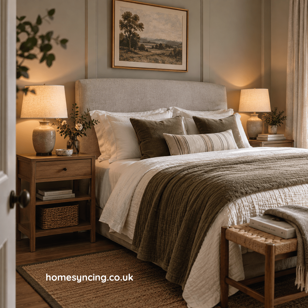
Matching bedside tables create an immediate sense of order and symmetry, particularly when paired with matching lamps.
But they do not have to be identical.
Two different pieces can work beautifully if their heights and visual weight are reasonably similar. This is particularly useful in bedrooms where space differs on either side of the bed.
Think about storage too.
A drawer is wonderfully useful for hiding chargers, reading glasses and the less photogenic necessities of bedtime.
Because a calm surface is considerably easier to achieve when there is somewhere nearby to put everything.
Create layers of light
If there is one thing capable of undoing all your careful bedroom styling, it is a single bright ceiling light.
Good hotel bedrooms rarely rely on one source of illumination.
They use layers.
Begin with bedside lamps. These provide soft pools of light and make the bed feel welcoming in the evening.
Then consider another source elsewhere in the room: perhaps a lamp on a chest of drawers, a floor lamp beside an armchair or wall lights either side of the bed.
The aim is to create different possibilities.
Bright enough to get dressed.
Soft enough to read.
Gentle enough for the last half-hour before sleep.
Warm-toned bulbs are generally more flattering and restful in bedrooms than harsh, cool light.
And if you can switch off the main light without getting out of bed, so much the better.
Use symmetry — then gently break it
There is a reason hotel bedrooms often feel immediately calm.
Symmetry.
A bed sits centrally. A table stands on either side. Two lamps frame the headboard. Cushions are arranged in pairs.
Our eyes understand the arrangement instantly.
At home, symmetry can provide the same sense of order.
But too much can begin to feel formal.
Once you have established the basic balance, introduce something slightly different.
Perhaps one bedside table holds flowers while the other has a small stack of books. A picture might sit slightly off-centre on a chest of drawers. An old chair in the corner can bring character to an otherwise polished room.
Perfect symmetry creates calm.
A little asymmetry makes it feel lived in.
Bring in a proper chair
There is something quietly luxurious about having somewhere to sit in a bedroom that isn’t the bed.
If space allows, introduce an armchair or occasional chair.
Place it near a window, perhaps, with a small table and lamp nearby.
It becomes somewhere to read in the morning, put on shoes or simply sit for a few minutes at the end of the day.
In a smaller bedroom, choose a lighter chair that doesn’t occupy too much visual space. An open wooden frame or slender upholstered design can provide comfort without making the room feel crowded.
And try not to let it become the place where clothes go to spend the night.
Although, in most real homes, some negotiation may be required.
Add a bench at the foot of the bed
If the room is large enough, a bench or ottoman at the foot of the bed can create an immediate sense of generosity.
It also has a purpose.
A bench gives you somewhere to sit while dressing, somewhere to place a throw and, if it contains storage, somewhere to hide spare bedding.
The proportions matter.
Choose something narrower than the bed so that it feels connected without overwhelming it.
In a smaller room, leave it out.
Trying to recreate a hotel suite by squeezing additional furniture into a modest bedroom will achieve the opposite effect.
Luxury needs breathing room.
Choose a calm colour palette
Boutique-hotel bedrooms do not have to be beige.
Deep blue, forest green, dusky pink, warm terracotta and rich earthy colours can all create wonderfully restful rooms.
What matters more is cohesion.
Choose a relatively restrained palette and allow it to repeat through walls, bedding, curtains and smaller details.
A warm neutral wall might be paired with natural timber, olive cushions and aged brass lamps.
A deeper blue bedroom could be softened with off-white bedding, walnut furniture and warm lighting.
Colour should envelop rather than compete.
And remember how dramatically colour changes throughout the day.
Always look at samples in morning light, afternoon light and under your bedroom lamps before committing to the whole room.
The colour you love at midday may become something quite different at ten o’clock in the evening.
Introduce natural materials
A beautiful bedroom needs texture.
Without it, even an expensive room can feel rather flat.
Wood is particularly useful because it brings natural variation and warmth. A timber bedside table, bench or chest of drawers can prevent upholstered surfaces and painted walls from feeling too polished.
Then add softer materials.
Linen.
Cotton.
Wool.
Velvet, used sparingly.
Woven baskets.
A thick rug beneath bare feet.
These materials appeal not only to the eye but to touch, which matters in a bedroom more than almost anywhere else in the house.
You encounter this room first thing in the morning and last thing at night.
It should feel good as well as look good.
Dress the windows generously
Curtains have an extraordinary ability to change the atmosphere of a bedroom.
Hung too narrowly or ending awkwardly above the floor, they can make windows feel smaller.
Full-length curtains, by contrast, bring height and softness.
Where practical, hang the curtain pole slightly wider than the window so the fabric can sit mostly beyond the glass when open. This allows more daylight into the room and makes the window appear more generous.
For bedrooms, consider combining curtains with blinds if you need greater control over light and privacy.
The fabric itself needn’t be elaborate.
Plain linen-look curtains, softly textured cloth or a subtle pattern can all work.
What matters is fullness.
A generous fall of fabric feels far more luxurious than curtains stretched reluctantly across the window.
Put a rug where your feet will find it
There are few things less luxurious than waking on a January morning and placing bare feet directly onto a cold floor.
A rug immediately brings warmth and softness to a bedroom.
If you have space, a large rug beneath the bed can help anchor the entire sleeping area.
Make sure enough of it extends beyond the sides of the bed to be seen — and, more importantly, stepped onto.
Alternatively, runners on either side can work well.
Choose texture carefully.
Bedrooms can take something softer underfoot than busy hallways and dining rooms.
Wool is an enduring choice, while natural woven textures can suit more relaxed interiors.
The rug doesn’t have to shout for attention.
Often its job is simply to make the room feel complete.
Keep clutter out of sight
Hotel bedrooms have one considerable advantage over our own.
They don’t contain our lives.
There is no pile of post on the chest of drawers, no overflowing laundry basket and no mysterious collection of cables accumulating beside the bed.
At home, therefore, storage becomes an essential part of creating the same sense of calm.
Use drawers.
Use cupboards.
Use baskets.
Give everyday things a place.
A bedside cabinet can conceal chargers and medication. A chest of drawers can hold smaller clothes. A storage bench can hide spare bedding.
The goal isn’t to create a room in which nobody appears to live.
It is simply to remove the visual noise that prevents the room from feeling restful.
Keep the things you enjoy seeing.
Find a home for the rest.
Give the walls something worth looking at
Boutique hotels often use artwork particularly well.
Not necessarily valuable art.
Just well-chosen pieces displayed with confidence.
One generous picture above the bed can provide a focal point, although always make sure anything hung above sleeping areas is securely fixed.
Alternatively, a pair of pictures can echo the symmetry of the bedside tables.
Elsewhere, smaller works can make the bedroom feel more personal.
Landscapes, botanical prints, photography and abstract pieces can all work.
Avoid choosing artwork simply because its colours match the duvet.
A bedroom becomes more interesting when the pictures have some meaning beyond completing the scheme.
Something discovered while travelling, inherited from family or simply loved for years will always bring more character.
Add a mirror with purpose
A good mirror does more than fill a wall.
It reflects light, creates a sense of depth and, rather usefully, lets you see whether your clothes work together before leaving the house.
A full-length mirror is invaluable if space permits.
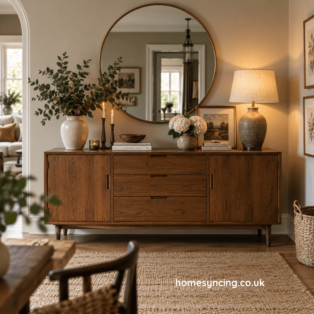
Otherwise, a generous mirror above a dressing table or chest of drawers can work beautifully.
Think carefully about what it reflects.
Positioned opposite or near a window, a mirror can borrow daylight and make the room feel brighter.
Placed opposite an attractive part of the room, it effectively gives you the view twice.
A beautiful frame can also introduce character — aged timber for warmth, metal for something more refined or a simple frameless design for a quieter look.
Create a dressing area
One of the pleasures of a good hotel room is that different activities have their own little places.
There is somewhere to sleep, somewhere to sit and somewhere to get ready.
You can borrow the same idea at home.
A console table can become an elegant dressing table when paired with a mirror and chair or stool.
Keep the surface relatively clear.
A small tray can hold perfume or jewellery. A lamp provides softer light in the evening. A drawer or nearby box keeps practical items out of sight.
Even a small dressing area can make the daily routine feel more considered.
And furniture that can serve more than one purpose is especially useful in smaller bedrooms.
Make the room smell good
Scent is one of those things we notice without always consciously registering it.
Hotels know this.
At home, it needn’t mean filling the bedroom with overpowering fragrance.
Freshly laundered bedding may be enough.
Open the windows regularly.
Bring in flowers when they are available.
A lightly scented candle can add atmosphere before bed, although it should of course be extinguished before you become too comfortable to remember it.
Diffusers and subtle room fragrances can work too.
The key word is subtle.
A bedroom should smell clean, fresh and familiar.
Not like the ground floor of a department store.
Borrow something from the garden
A room can become noticeably softer when something living is brought into it.
A few garden flowers in a small vase.
A branch of blossom in spring.
Leafy stems in summer.
Rosehips or turning foliage in autumn.
Even bare winter branches can be beautiful in the right vessel.
There is no need for an elaborate florist’s arrangement.
In fact, something loosely gathered often feels more at home.
This is particularly effective in a bedroom that has been carefully styled.
Natural shapes prevent the room becoming too perfect.
They remind us that a home is not a hotel after all.
And that is a good thing.
Include something old
A boutique-hotel bedroom becomes memorable when it has character.
At home, one of the easiest ways to achieve this is to introduce something with age.
An old bedside table.
A vintage mirror.
A small antique chest.
An inherited chair.
A painting in a time-worn frame.
Older pieces bring patina and individuality, particularly when surrounded by newer furniture.
They also prevent the room from feeling as though everything arrived on the same delivery van.
British interiors have always evolved through different periods and generations. Furniture, textiles and decorative ideas were added, adapted and replaced as tastes changed.
Your bedroom can do the same.
The aim isn’t to recreate a historical room.
It is to give the present a little company from the past.
Pay attention to the small things
Often it is the smallest details that make a hotel bedroom feel particularly considered.
A carafe or glass of water beside the bed.
A proper place for jewellery.
A tray on the dressing table.
A small dish for loose change.
Books within reach.
A blanket for cold nights.
These things aren’t expensive.
They are thoughtful.
And thoughtfulness is one of the most convincing forms of luxury.
Look at your bedroom as though you were arriving in it for the first time.
What would you need?
Where would you put your phone?
Is there somewhere to sit while putting on shoes?
Can you switch off the bedside lamp comfortably?
Is there somewhere to put a cup of tea?
The answers often reveal more than another round of decorating ever could.
Don’t make it so perfect that it stops feeling like home
This is perhaps the most important part.
You are borrowing ideas from a boutique hotel.
You are not actually creating one.
Your bedroom should contain your books, your photographs and the furniture you have gathered over time.
There can be a dressing gown on the back of the door.
The pillows don’t have to be perfectly arranged every morning.
A favourite old chair can remain even if it isn’t quite the same shade as the headboard.
These things give the room life.
The best boutique hotels understand this too. The memorable ones rarely feel anonymous. They use art, old furniture, interesting fabrics and local details to create a sense of place.
At home, you already have something better.
A sense of your place.
Creating your own boutique-hotel bedroom
So, how do you create a boutique-hotel bedroom at home?
Begin with comfort rather than decoration.
Make the bed the centre of the room and choose bedding that feels wonderful to sleep in. Give yourself useful bedside tables and good reading lights. Add curtains that soften the windows, a rug beneath your feet and enough storage to keep everyday clutter under control.
Then layer in character.
Natural wood.
A favourite picture.
An old chair.
Books beside the bed.
Flowers when the garden provides them.
The result shouldn’t feel like a room waiting for a guest.
It should feel like somewhere you are rather pleased to return to yourself.
Because perhaps the greatest luxury of a beautiful hotel bedroom isn’t the crisp sheets, the carefully chosen furniture or even breakfast arriving at the door.
It is that wonderful feeling of closing out the rest of the world for a while.
And that is something worth bringing home.
Further Reading: How to Create a Bedroom Retreat, Affordable Decorating Ideas That Will Transform Your Home, Sustainable Chic: A Beginner’s Guide to Circular Design, Small Room, Big Impact
Daily Inspiration: Follow Us on Instagram, BlueSky, Threads , Pinterest, Twitter, TikTok