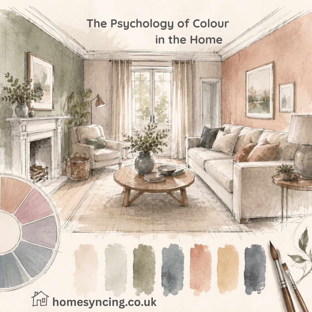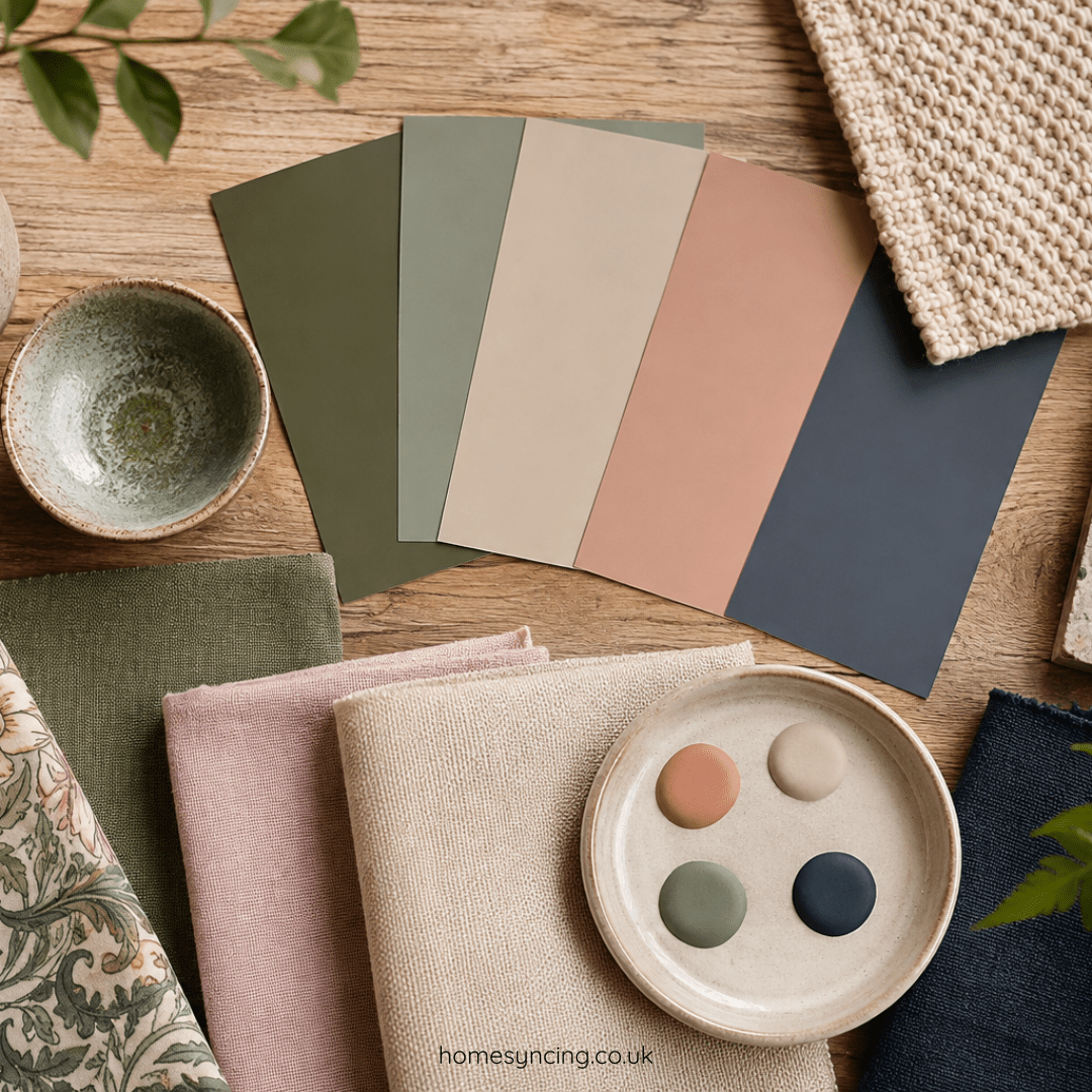
Colour has the remarkable ability to change how a room feels. It can make a space feel calm and restful, bright and welcoming, or warm and cosy. The colours we surround ourselves with influence the atmosphere of our homes, helping to create spaces that reflect our personalities and the way we want to live.
Choosing colours for your home can sometimes feel overwhelming. With countless shades, tones and combinations to choose from, it is easy to wonder where to begin. However, creating a beautiful colour scheme does not require following strict rules. The most successful interiors are often those that feel natural, balanced and personal.
Whether you are refreshing a single room or planning a complete home makeover, understanding how colours work together can help you create a space that feels harmonious and timeless.
Begin with colours you naturally love
The best place to start is with colours that make you feel comfortable. Trends come and go, but the shades that you are naturally drawn to will create a home that feels authentic.
Think about the colours that already surround you. Perhaps you are drawn to the soft greens and earthy tones found in nature, the warmth of terracotta and ochre, or the calm simplicity of gentle neutrals.
Look at your wardrobe, favourite artwork, treasured objects and even the view from your windows. These can all provide inspiration for a colour palette that feels connected to you.
A home should not simply follow a trend — it should feel like a reflection of the people who live there.
Understand the role of different colours
Every colour brings a different feeling to a room. While personal preference is the most important consideration, understanding how colours influence a space can help you make confident choices.
Greens create a connection with nature and can bring a sense of calm and balance. They work beautifully in living rooms, bedrooms and spaces filled with natural light.
Blues are often associated with tranquillity and can create a peaceful atmosphere, making them well suited to bedrooms and relaxing areas.
Warm neutrals, such as creams, beige and soft browns, provide a gentle backdrop that allows furniture and accessories to take centre stage.
Earthy shades, including terracotta, clay and muted yellows, add warmth and character while creating a welcoming feel.
Deeper colours, such as charcoal, forest green or navy, can add richness and drama when used thoughtfully.
The key is not simply choosing a colour you like, but considering how it will work within the whole room.
Create a simple colour palette
A useful approach when decorating is to choose three main colours:
- A dominant colour – the main shade that sets the mood of the room, often used on walls or larger areas.
- A secondary colour – a complementary shade introduced through furniture, curtains or larger accessories.
- An accent colour – a smaller touch of contrast through cushions, artwork, lamps or decorative pieces.
This approach helps create balance without making the room feel too uniform.
For example, a calm living room might combine soft sage green walls, natural wooden furniture, warm cream fabrics and small touches of muted gold or deep olive.
Consider the light in your home
The way a colour appears can change dramatically depending on the light in a room. A shade that looks perfect in a bright showroom may feel completely different at home.
Natural light from a south-facing room can make colours appear warmer, while rooms with less sunlight may benefit from softer, lighter shades.
Before committing to a colour, test samples on your walls and observe them throughout the day. Notice how they change in the morning, afternoon and evening.
The relationship between colour and light is one of the reasons some homes feel effortlessly welcoming — the colours have been chosen with the space itself in mind.
Connect different rooms together
A home feels more comfortable when rooms flow naturally from one to another. This does not mean every room needs to be the same colour, but there should be a sense of connection.
You can create this by repeating small elements throughout your home:
- Using similar wood tones in different rooms.
- Carrying an accent colour from one space into another.
- Choosing complementary shades rather than completely separate palettes.
- Using similar materials, such as linen, wool or natural fibres.
These subtle links create a home that feels thoughtfully designed.
Use furniture and accessories to introduce colour
Colour does not only belong on walls. Furniture, artwork and accessories can be wonderful ways to bring personality into a room.
A neutral room can be transformed with a beautifully upholstered chair, a colourful rug or a piece of artwork that adds interest.
Equally, if you love bold wall colours, keeping furniture and accessories more understated can allow the room itself to become the feature.
Consider how your furniture works with your chosen colours. Natural wood, for example, pairs beautifully with greens, blues and warm neutrals, while contemporary furniture can often provide a clean contrast against richer shades.
Do not be afraid of contrast
While harmony is important, a room can become flat if every colour is too similar. Adding contrast creates depth and prevents a space feeling one-dimensional.
A dark piece of furniture against a lighter wall, a patterned cushion on a plain sofa, or a striking piece of artwork in a simple room can create interest.
The secret is balance. Contrast should highlight the beauty of your home rather than compete with it.
Embrace timeless colour choices
A timeless home is not one that avoids colour — it is one where colour has been chosen carefully.
Natural shades inspired by the landscape, classic neutrals and gentle tones often create interiors that remain appealing for years. These colours provide a wonderful foundation that can easily be updated with accessories as your tastes change.
Rather than repainting every time a new trend appears, choose colours that you will enjoy living with.
Creating a home that feels right
Choosing colours for your home is about more than creating a stylish room. It is about creating an environment where you feel comfortable, relaxed and happy.
The most beautiful homes are those where colours work together naturally, where furniture and accessories feel connected, and where every room tells a little story.
Take inspiration from the world around you, trust your own preferences and allow your home to develop over time. With thoughtful choices, colour can bring warmth, character and a sense of belonging to every corner of your home.
Further Reading: Affordable Decorating Ideas That Will Transform Your Home, Sustainable Chic: A Beginner’s Guide to Circular Design, The Psychology of Colour in the Home
Daily Inspiration: Follow Us on Instagram, BlueSky, Threads , Pinterest, Twitter, TikTok