Bold Black Interior Design: A Striking Trend for 2025

Sophisticated, dramatic, and undeniably chic—black has reclaimed its throne as a design staple, and this time it’s bolder than ever. From sleek raven accents to daring monochrome spaces, black is transforming interiors into powerful, high-impact havens. Are you ready to make a statement?

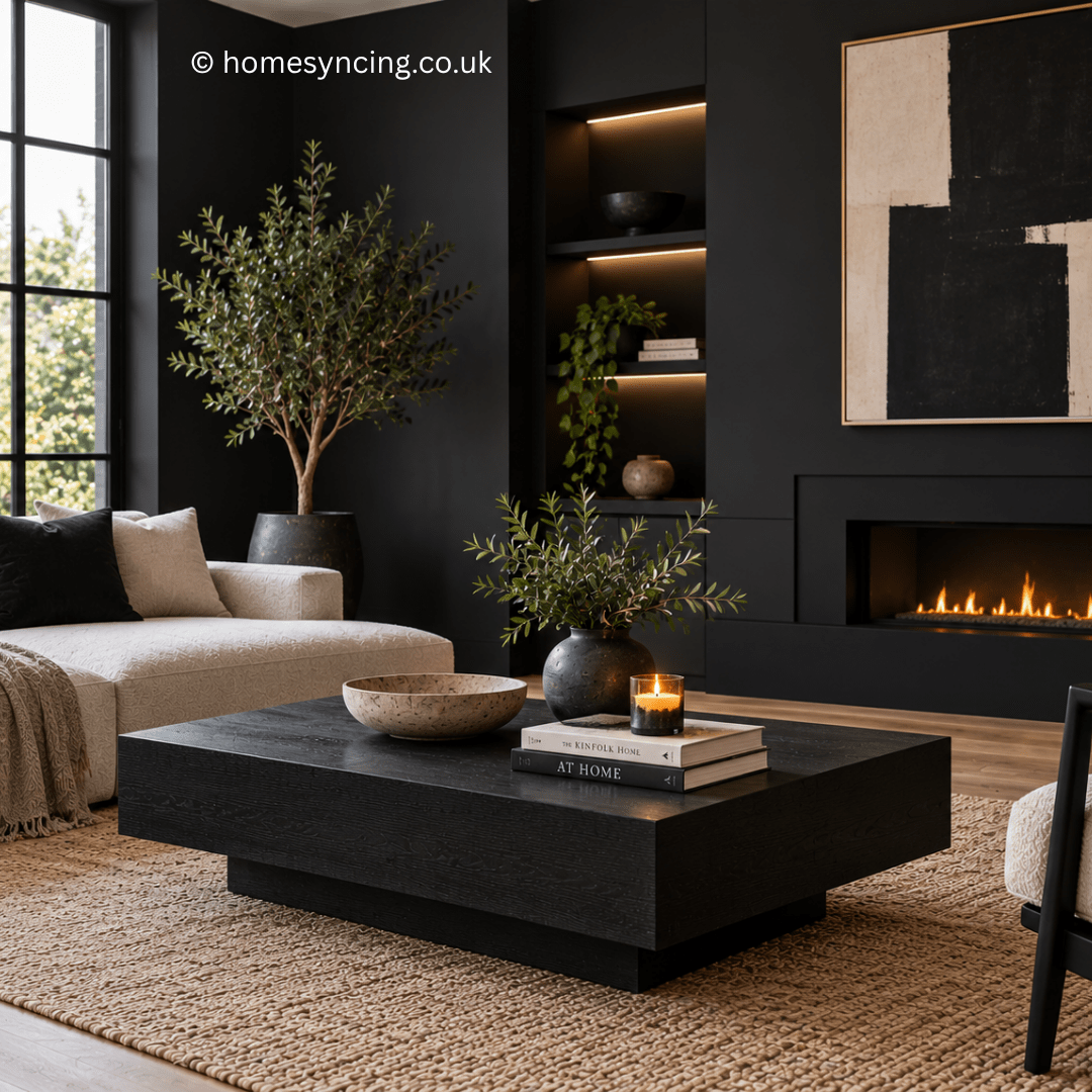
Black Interior Styling Image

Why Black?

Black often carries with it an air of mystery and elegance, but in 2025, it’s not just elegant—it’s audacious. Used strategically, black can add depth, contrast, and a sense of modernity to any space. When paired with other colours and textures, it anchors the room, allowing every other element to shine.

But why stop at a few accents when you could go all in? Entirely black interiors are having an unforgettable moment. Far from being overwhelming, the right execution creates a cosy, cocoon-like atmosphere that’s as inviting as it is dramatic.

How to Incorporate Black into Your Interiors

If you’re ready to take the plunge but unsure of where to begin, here are some stylish and practical ways to introduce the boldness of black into your home design.

1. Raven Accents for Subtle Impact

Not quite ready to go full monochrome? Start small. Think sleek black furniture, light fixtures, vases, or picture frames. Against a backdrop of neutrals or lighter tones, these touches create a striking contrast.

A velvet black armchair nestled in a neutral living room or matte black handles in an otherwise all-white kitchen can redefine the space entirely. These subtle touches are like punctuation marks in your design, adding definition and character.

2. The Power of Contrast

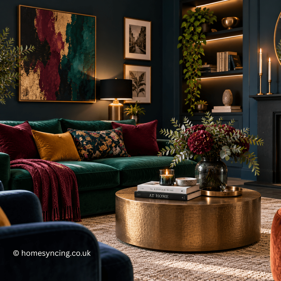
Black thrives on contrast. Pair it with crisp whites for a timeless black-and-white theme, or soften its intensity with warm hues like terracotta or beige. Want something edgier? Try pairing black accents with jewel tones like deep emerald green or sapphire for an opulent feel.

Focus on balance—black works best when it’s offset by lighter tones and complementary colours, ensuring that the dramatic doesn’t become overpowering.

3. Create Drama Through Black Fixtures

Transform your bathroom or kitchen by incorporating black fixtures. Think sleek black taps, door handles, or light fittings. These small touches add just the right amount of boldness while maintaining a luxurious and modern edge.

Black doesn’t just play well with colour—it also thrives when paired with texture. Combine frosted glass, rough stone, or brushed metal with black fixtures for added intrigue and character.

4. Go All-In with Monochrome Magic

Feeling brave? Step into the world of blacked-out interiors. A black wall, complemented by matching furniture and décor, creates an intimate yet impressive space. To avoid the room feeling flat, focus on layering textures. Mix matte paint with plush upholstery, glossy finishes, or natural wood to bring depth and visual appeal.

Add soft lighting to underline the ambience—think strategically placed floor lamps or pendant lighting to keep the space inviting and cosy.

5. Black in Unexpected Spaces

Why confine black to your living room or kitchen? Take it to places that surprise. A black ceiling, for instance, adds a dramatic flair that makes any room feel unique. Alternatively, line your home office shelves with black accents or paint the back of your bookcases black to highlight their contents.

Bathrooms, often overlooked, are reborn with black tiling or a matte black vanity. These unexpected choices turn functional rooms into design features.

The Benefits of Bold Black Design

Wondering if this trend is worth it? Here’s why black should make it to the top of your design list in 2025:

  • Timeless Elegance: Black is classic. It never truly goes out of style, and its timeless appeal ensures longevity.
  • Versatile Foundations: Black works with virtually any colour palette, giving you limitless creativity with your design.
  • Depth and Dimension: Whether used as an accent or a predominant shade, black effortlessly adds depth, making spaces feel more dynamic.
  • A Statement Piece Every Time** : Black commands attention without shouting. It’s bold, and yet it feels effortless.

Final Thoughts – Dare to Design

Black is more than just a colour—it’s a powerful design tool that can elevate your interiors from ordinary to extraordinary. Whether you’re adding a touch of raven or going full monochrome, this sophisticated hue offers endless possibilities to anyone bold enough to incorporate it.

Our Black is Back Edit ⬤

Follow us on Instagram for Daily Inspiration

Transform Your Space with Rich Jewel Tones

Are you ready to elevate your home décor game? Rich jewel tones have been reigning supreme in interior design—and they’re not going anywhere. These bold, sumptuous colours are timeless, effortlessly infusing any room with a sense of luxury, drama and opulence.

What Are Jewel Tones?

Inspired by the brilliance and depth of gemstones, rich jewel tones include colours like emerald green, sapphire blue, ruby red, amethyst purple and topaz gold. Just like their namesakes, these shades are deeply saturated and rich, offering an unmatched vibrancy.

But here’s the magic—they don’t just radiate boldness; they have an innate ability to pair beautifully with other colours and textures, unlocking endless possibilities for your décor.

Why Jewel Tones Are Timeless in Decor

Think of jewel tones as the little black dress of interior design—versatile, classic and always in style. They’ve been trending for years and experts predict this palette will remain a go-to choice well into 2025. Why? Because jewel tones strike that perfect balance between grandeur and accessibility.

  • Luxury & Drama

They immediately elevate the look and feel of a space. A plush emerald green velvet sofa or sapphire blue accent wall screams sophistication.

  • Versatility Across Styles

Jewel tones work regardless of your interior design approach. From modern glam and mid-century vibes to boho chic or classic Victorian detailing, these colours weave themselves beautifully into any aesthetic.

  • A Sense of Comfort

While vibrant, these hues carry a depth that feels grounding and inviting, making even the boldest choices feel warm and livable.

How to Use Jewel Tones in Your Home

Now that you know why jewel tones are here to stay, how can you incorporate them into your space? Here are some ideas to get you started:

1. Choose a Statement Piece

Make a bold impact with a key item that serves as the focal point of your room.

  • A ruby-hued armchair? Perfect for adding a romantic touch.
  • An emerald green area rug? Instantly anchors your living room.

Using a single piece in a jewel tone allows you to play with the trend while keeping the rest of the space neutral.

2. Paint It Bold

One of the easiest ways to experiment with jewel tones is through paint.

  • A navy sapphire feature wall in a bedroom creates a cosy yet dramatic vibe.
  • Amethyst purple paired with brushed gold hardware in your office space spells elegance.

The key is to balance these strong shades with neutral trims or lighter accent walls to keep the space balanced.

3. Accessorise with Flair

Not ready for a big commitment? Start small.

  • Drapes, cushions, or throws in jewel tones can layer richness into your décor. Imagine the decadence of topaz yellow cushions against a white linen sofa.
  • Opt for small touches like a sapphire vase or emerald glassware—they add a pop without overwhelming the room.

4. Pair with Neutrals or Pastels

To avoid an overload of drama, pair your jewel tones carefully.

  • Neutrals: Whites, greys, or soft beiges provide a calm backdrop that lets your bold pieces shine.
  • Pastels: Add a whisper of butter yellow or powder pink to complement and soften the intensity of rich tones.

This approach creates balance and prevents the space from feeling “too heavy.”

5. Get Playful with Textures

Velvet, silk, and satin are natural companions to jewel tones. Why? Because their reflective surfaces amplify the already stunning depth of these hues. A sapphire velvet cushion or an emerald porcelain lamp can add both texture and sophistication to your home.

Jewel Tones Wait for No One!

What are you waiting for? Whether you introduce jewel tones through a DIY accent wall or add a plush emerald throw to your sofa, the possibilities are endless. These colours will revolutionise the way your home feels—transforming it into a vibrant, luxurious sanctuary.

Rich jewel tones are your invitation to turn a house into a home that sparkles with personality and style. Go bold. Get creative. Make a statement.

Further Reading: Interior Design Trends for 2025

Follow us on Instagram for daily inspiration

The Gallery Wall: How to Revive Your Space with Art and Objects

There is something irresistible about a wall covered with things somebody has chosen because they genuinely love them.

An old landscape found in a market sits beside a botanical print. A tiny family photograph occupies a gilt frame that is rather grander than necessary. Perhaps there is a piece of embroidery, a ceramic plate or a drawing brought home from a holiday.

Nothing quite matches, and that is precisely why it works.

For several years, the gallery wall became an interiors formula: matching frames, carefully measured gaps and prints arranged into an immaculate grid. There is still a place for that ordered approach, but increasingly the most interesting gallery walls feel rather less obedient.

They borrow something from the way pictures have accumulated in houses for generations – gradually, instinctively and with little concern for whether every frame belongs to the same collection.

The result is a wall that feels less decorated and more collected.

And that is where its real character begins.

Gallery Walls Have Always Been About Collecting

The idea of filling a wall with pictures is hardly new.

Historic houses, galleries and private collections have long displayed paintings in groups, sometimes extending upwards towards the ceiling. Pictures of different subjects, periods and sizes might sit remarkably close together.

Domestic collections were often similarly personal.

Portraits joined landscapes, prints, maps and drawings as families inherited, bought and rearranged things over generations.

The lesson for today’s home isn’t to recreate a historic picture hang.

It is that an engaging wall doesn’t necessarily need perfect uniformity.

Allowing pictures to differ in scale, frame, subject and age can produce something far richer.

Start with Art You Actually Want to Look At

Before thinking about layouts, begin with the pictures.

A gallery wall shouldn’t exist simply because a large wall needs filling.

Look for art that makes you stop.

It might be an original painting, an inexpensive print, a child’s drawing, a photograph, an old map or a botanical study. Exhibition posters, sketches and pieces of textile can be just as interesting when thoughtfully framed.

Second-hand shops, markets and auctions can be wonderful places to look because the search itself becomes part of the pleasure.

You needn’t understand why everything works together immediately.

Collections often become interesting precisely because they weren’t bought all at once.

Find One Piece to Begin the Story

A successful gallery wall often has an anchor.

This doesn’t necessarily mean placing the largest picture exactly in the middle. Instead, choose one piece with enough presence to establish the composition.

A colourful landscape, large abstract work, botanical print or portrait might do the job.

Then begin adding smaller pieces around it.

This creates a more natural rhythm than starting with an imaginary grid and trying to find artwork to fit each predetermined rectangle.

Let the collection determine the arrangement rather than the arrangement determining the collection.

Forget Perfect Symmetry

One of the easiest ways to give a modern gallery wall more character is to loosen the geometry.

Perfect rows and identical frames create order, which can be useful in contemporary interiors or for a collection of closely related photographs.

But if you want the wall to feel collected and expressive, allow the edges to wander.

Hang a tall picture beside a landscape-format work. Place a circular plate or mirror among rectangular frames. Let smaller pictures occupy the gaps between larger ones.

The arrangement should still feel balanced, but balance doesn’t require symmetry.

Think of it more like arranging flowers.

Different heights, shapes and colours can work together without being identical.

Mix Frame Styles

Frames are an important part of a gallery wall, but they don’t all have to match.

In fact, mixing them can be one of the simplest ways to introduce character.

Warm timber might sit beside aged brass, dark-painted wood and a fine contemporary frame. An ornate gilt frame can make a wonderful contrast with something deliberately plain.

The trick is repetition.

If one brass frame appears alone, it can look accidental. Repeat a similar warm metallic tone elsewhere and it begins to feel intentional.

The same applies to timber and darker frames.

Aim for relationships rather than uniformity.

And don’t overlook mounts. A generous mount can give a small drawing more presence, while an older painting may look perfectly at home without one.

Put More Than Pictures on the Wall

Some of the most memorable gallery wall ideas move beyond framed art altogether.

A decorative plate can introduce a circular shape. A small mirror catches light. A piece of embroidery brings texture. Woven objects, shallow ceramics and sculptural pieces can all break up the procession of rectangular frames.

The important thing is that they have a reason to be there.

An inherited plate, something made by a local craftsperson or an object brought home from travelling will usually add more character than something bought simply because a gap needed filling.

This is where a gallery wall can become genuinely personal.

It stops being a collection of pictures and becomes a collection of memories.

Introduce Colour with Confidence

A gallery wall is a wonderful place to be braver with colour.

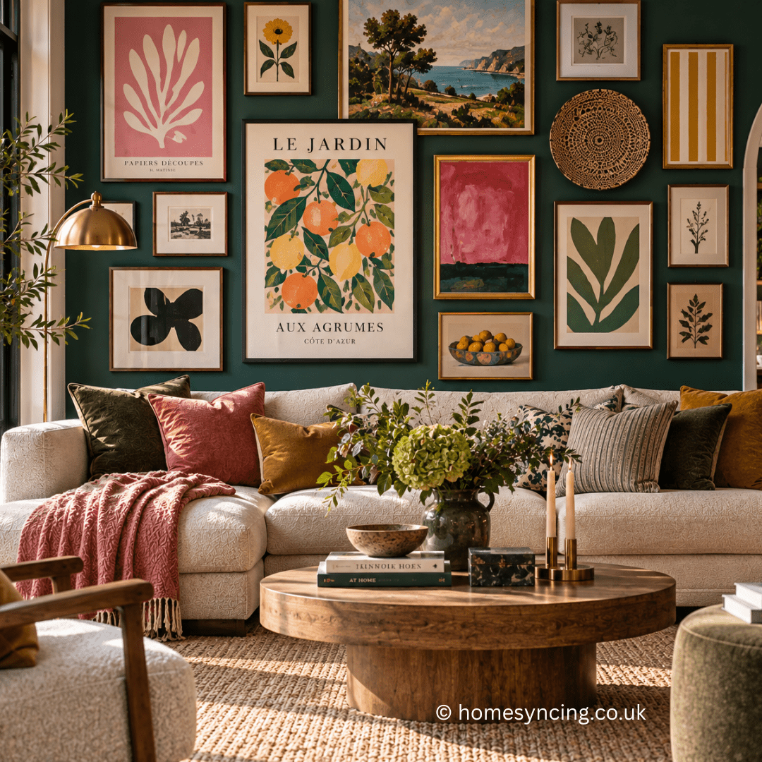
A deep green, warm blue or earthy painted wall can make artwork appear remarkably vivid, particularly when combined with timber and gilt frames.

Alternatively, a pale wall allows colourful paintings and prints to provide the energy.

Look within the artwork itself for connections.

A mustard yellow in one botanical print might reappear in an abstract painting. A coral detail could be picked up by a cushion elsewhere in the room. Olive green might travel from a landscape into upholstery or painted furniture.

These connections needn’t be obvious.

When colours quietly recur around a room, the eye recognises the relationship even when we don’t consciously notice it.

Mix Large and Small Artwork

Scale creates energy.

A wall covered entirely with similarly sized pictures can become visually repetitive, no matter how beautiful the individual pieces are.

Instead, introduce contrast.

Allow one or two larger works to command attention and use smaller pictures around them to create movement.

Tiny pieces can be particularly effective.

A miniature painting or photograph surrounded by larger works encourages you to move closer and inspect it. These changes in scale make the wall more engaging because the eye doesn’t take everything in at once.

Avoid making every gap identical too.

Some variation in spacing can help a more informal collection feel natural, provided the overall composition remains connected.

How High Should You Hang a Gallery Wall?

There is no single measurement that works in every house.

Ceiling height, furniture and the proportions of the artwork all matter.

As a broad starting point, galleries often position the centre of an individual artwork at roughly eye level. At home, however, the relationship with nearby furniture can be more important than a particular number.

A gallery wall above a sofa should feel visually connected to the sofa rather than floating somewhere near the ceiling.

The same applies above a sideboard, console or fireplace.

Stand back frequently while planning.

The wall should belong to the entire room, not exist independently from everything beneath it.

Plan the Layout Before Reaching for a Hammer

An informal gallery wall may look spontaneous, but a little preparation can save a great many unwanted holes.

Begin by arranging the pieces on the floor.

Move them around until the balance feels right. Take a photograph once you’re happy so you have something to refer to.

For a larger arrangement, cut paper templates corresponding to the dimensions of the frames and attach them temporarily to the wall.

This allows you to experiment with spacing and position at full scale.

Look at the composition from different parts of the room.

Then leave it overnight.

Something that seemed perfect after an hour of rearranging can look surprisingly different the following morning.

Work with the Architecture

Before deciding where your gallery wall should go, look at the room itself.

A staircase naturally lends itself to an arrangement that rises with the steps. An alcove might suit a tighter group of smaller pictures. A large wall above a sofa can accommodate a more expansive collection.

Architectural features can become part of the composition too.

A gallery wall surrounding a doorway can be wonderfully effective, while artwork arranged around a wall light or above panelling can feel as though it has gradually accumulated with the house.

Don’t automatically choose the largest uninterrupted wall.

Sometimes the more unexpected position has considerably more charm.

Gallery Walls Can Work in Small Spaces

You don’t need a grand sitting room to create one.

In fact, gallery walls can be particularly effective in the overlooked parts of a house.

A collection of small landscapes can enliven a hallway. Family photographs can follow the staircase. Botanical prints might fill a kitchen corner, while a handful of tiny paintings can transform the wall beside a bed.

Even a downstairs cloakroom can become an opportunity for art.

Small rooms often give you greater freedom because you aren’t viewing the wall from a great distance.

A close arrangement of unusual pictures can turn a previously forgettable space into one of the most characterful corners of the house.

Light Your Artwork Thoughtfully

Good lighting allows a gallery wall to change character after sunset.

Picture lights can create pools of warm illumination, while a wall light incorporated into the arrangement can become part of the composition itself.

Floor and table lamps positioned nearby can be equally effective and often produce a softer atmosphere.

Be mindful of the artwork itself.

Strong direct sunlight can fade works on paper, photographs, textiles and some pigments over time. Particularly treasured or valuable pieces may benefit from conservation-quality framing and appropriate glazing.

If you’re unsure about preserving an important work, advice from a professional framer or conservator is worth seeking.

Give Old Frames Another Look

Old frames are worth seeking out in their own right.

A slightly worn gilt frame can bring richness to a contemporary print. Dark timber can give a botanical drawing more weight, while a painted frame might provide exactly the note of colour a composition needs.

Markets, second-hand shops and auctions often contain frames whose contents are less interesting than the frames themselves.

Small scratches and signs of age needn’t always be restored away.

Patina can give a gallery wall the sense that it has evolved rather than been installed.

Just make sure older frames and hanging fittings are structurally sound before putting them on the wall.

Don’t Buy a Gallery Wall All at Once

Perhaps the easiest way to make a gallery wall look contrived is to buy the entire thing in an afternoon.

Allow it to develop.

Hang five pieces now and leave room for another.

You may find a little landscape six months later or rediscover a photograph in a drawer. Perhaps a print comes home from an exhibition or somebody gives you a small painting.

Add it.

Move something else if necessary.

There is no reason a gallery wall ever needs to be declared finished.

Avoid Styling Away the Personality

There is a point at which carefully curated can become overly curated.

If every picture shares precisely the same colours as the cushions, rug and curtains, the room can begin to feel more like a showroom than a home.

Let something be unexpected.

Keep the painting that doesn’t quite match because you love it.

Hang the peculiar little drawing that makes you smile. Give the inherited picture a place even if its frame is more elaborate than everything around it.

Individuality usually comes from the things that resist the scheme slightly.

Those are often the things people remember.

A Wall That Tells Your Story

The enduring appeal of a gallery wall isn’t really about filling an empty space.

It is about bringing together things that would otherwise remain scattered through drawers, cupboards and memories.

Pictures bought on holidays. Family photographs. Art discovered in markets. A child’s drawing that deserved a proper frame. Something inherited whose history is only partly remembered.

Individually, these objects may be modest.

Together, they can transform a room.

So don’t worry too much about creating the perfect gallery wall. Start with something you love, add another piece when you find it and allow the arrangement to change as the years pass.

Eventually, the wall will become something no interiors trend can reproduce.

A portrait, in fragments, of the people who live there.

Further Reading: How to Choose Wall Art for your Home

For Daily Inspiration Follow us on Instagram
Grounding Colours in Interior Design

Have you heard the term “grounding colours” thrown about in design conversations? If it sounds like fancy designer jargon, don’t worry—it’s more straightforward than you think. Grounding colours are simply shades that make a room feel calm, balanced and firmly rooted. They’re the unsung heroes of interior design, weaving harmony and warmth into your living spaces.

If you’ve been craving a home that feels like a sanctuary rather than a showroom, grounding colours might just be the secret ingredient you’re looking for. Grab your swatches and let’s explore the power of grounding hues.

“Mere color, unspoiled by meaning, and unallied with definite form, can speak to the soul in a thousand different ways.”
- Oscar Wilde

What Are Grounding Colours?

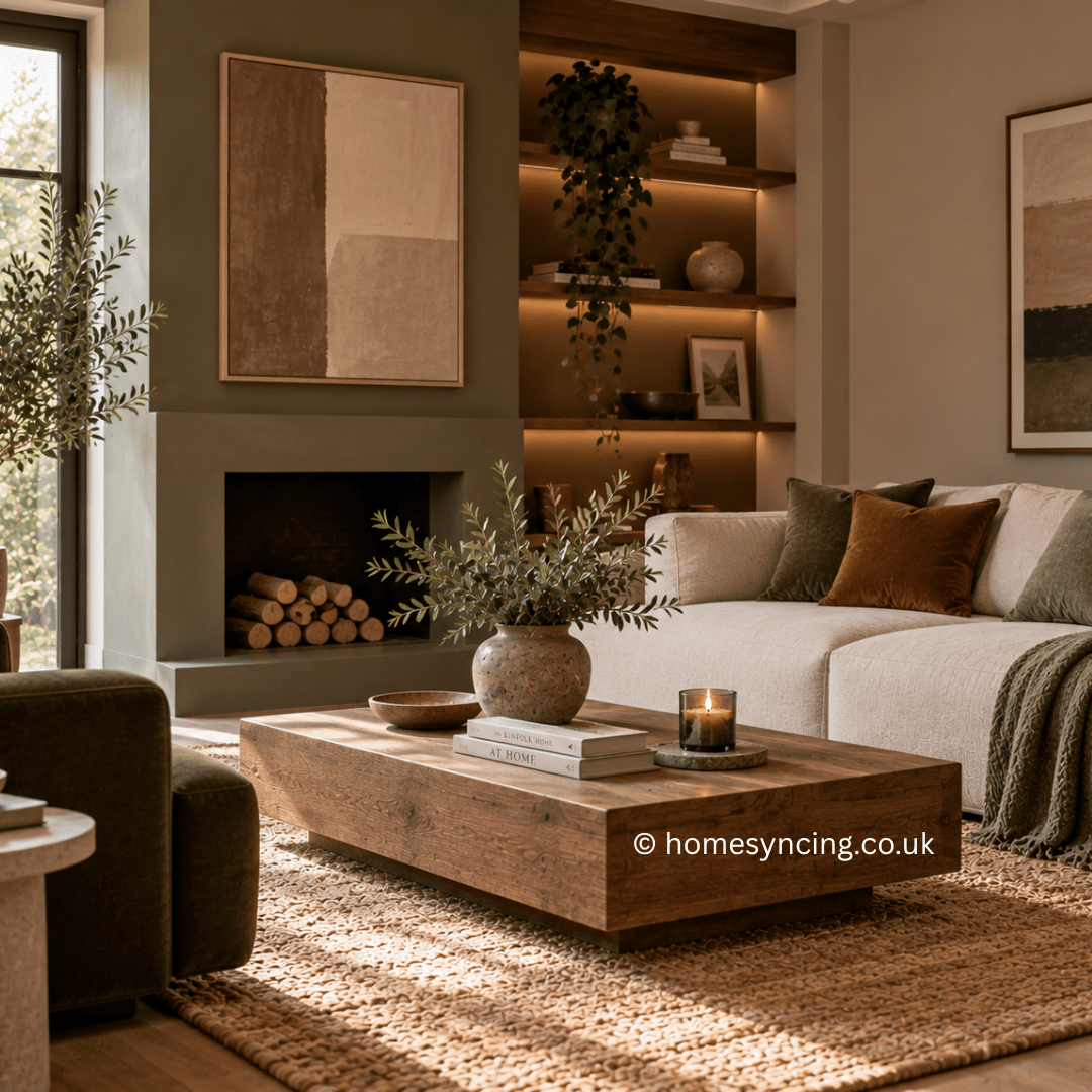
Grounding colours, in essence, are tones that provide stability and peace to a room. Think of deep browns, earthy greens, slate blues and moody greys—colours that carry a sense of visual weight and depth. Unlike brighter pastels or creams, these hues are rooted in nature and they have the ability to anchor a space, emotionally and visually.

Picture entering a room painted in earthy green. You immediately feel comforted, almost as if the walls are giving you a gentle hug. Or imagine sitting in a grey-blue living room while it’s raining outside—serene, right? That’s the magic of grounding colours.

Why Grounding Colours Are on the Rise

We’re seeing grounding colours crop up more and more in interior design, and it’s no coincidence. After years of all-over neutrals like stark whites, beiges and greiges dominating our homes, many spaces have started to feel a bit… washed out. Don’t get us wrong—neutrals have their place, but overusing them can make a room feel lifeless.

Grounding colours are a shift towards something richer and more dynamic. They’re a response to our yearning for spaces that feel lived-in, cosy, and reflective of the natural world. It’s a trend that doesn’t just look beautiful—it feels good too.

How to Use Grounding Colours in Your Home

Feeling inspired yet? Incorporating grounding colours is easier than you might think, whether you’re revamping your entire space or making smaller styling tweaks. Here are some ideas to get you started:

1. Anchor the Room with a Feature Wall

Thinking about a bold change? A feature wall in a grounding shade like forest green or charcoal can command just the right amount of attention. Whether it’s your living room or bedroom, this focal point provides depth and cosiness without overwhelming the space.

2. Update Your Furniture

If you’re not ready for paint, why not bring in grounding hues through your furniture? A deep-brown leather sofa, navy velvet armchair or walnut coffee table introduces richness and pairs beautifully with existing neutrals.

3. Layer Through Textiles

One of the quickest ways to bring in grounding colours is through textiles like cushions, throws, curtains and rugs. A grey-blue wool throw over a cream couch or terracotta cushions added to your bed creates a sense of comfort and visual interest instantly.

4. Accessorise with Greenery

When in doubt, go green—literally! Houseplants are the perfect way to introduce grounding tones while connecting your home to nature. Think mossy greens and olive hues through plants like ferns, rubber plants, or trailing ivy.

5. Create a Balanced Palette

Grounding colours are about harmony, so balance is key. Pair darker grounding hues with lighter neutrals to keep your space from feeling heavy. For instance, pair a slate blue wall with white trim and taupe furnishings for a refined, layered look.

Can Grounding Colours Work with DIY Projects?

Absolutely! If you’re taking on DIY home decor projects, grounding colours bring sophistication to even the simplest updates. Try painting a vintage dresser in a muted green or transforming basic wooden shelves into stylish statement pieces with a deep walnut stain.

Better yet, grounding colours work incredibly well with upcycled projects too! An old mirror frame could be painted navy or mismatched picture frames could be unified with an earthy brown for a curated gallery wall effect.

Not a DIY expert? No problem. The beauty of grounding colours is that even small changes (like swapping a few accessories) can make a world of difference.

The Emotional Power of Grounding Tones

It’s not just about aesthetics—colour psychology shows that grounding shades bring composure and clarity to spaces, which can impact your overall mood. Rooms with grounding colours often feel more intimate and secure, making them ideal for spaces where you want to relax, like bedrooms and lounges.

But they’re not limited to “calming” areas either. Paired with the right accents, grounding colours can also add elegance to dining rooms or create a professional feel in home offices. Their versatility knows no bounds.

Tips for Choosing the Perfect Grounding Colours

If you’re not sure where to start, here’s a quick cheat sheet:

  • For Warmth: Opt for terracotta, deep mustard or olive green.
  • For Cool Vibes: Choose slate blue, charcoal or mossy green.
  • For a Timeless Look: Stick to greys, taupes and chocolate browns.

And remember, lighting matters! Test swatches on your wall and observe how the colours change throughout the day. What may look lively in the morning light could feel somber in the evening, so get a sense of how your chosen hues behave.

Final Thoughts

When done right, grounding colours have the power to elevate your home from ordinary to extraordinary. They’re calming yet bold, elegant yet approachable, making them a perfect choice for any interior design style. Whether you’re painting an entire room, adding a statement piece, or experimenting with accessories, these versatile shades will transform your space into the retreat you’ve always dreamed of.

Now it’s your turn to channel those creative vibes. Which grounding colour will you use to transform your home? Time to grab your paintbrush (or your Pinterest board) and get inspired!

Further Reading: Interior Design Trends for 2025

Daily Inspiration: Follow us on Instagram

Transform Your Space with Baked Earth Colours

Are you ready to infuse your home with the warmth and charm of nature? Baked earth colours are the latest interior design trend sweeping through eco-conscious homes—and for good reason. These rich, grounding tones draw inspiration from the natural world, bringing a timeless elegance and sustainability to any living space.

Whether you’re an interior design enthusiast or a sustainable living advocate, this guide will inspire you to weave these soul-soothing hues into your home.

What Are Baked Earth Colours?

Imagine warm ochres, deep terracottas, dusty rose pinks and earthy clays. These tones are the embodiment of nature—evoking sun-baked landscapes, clay-rich soil and rustic tranquillity.

Baked earth colours are muted enough to feel sophisticated yet vibrant enough to add character. They seamlessly blend with natural materials like wood, stone, linen and jute, creating a harmonious balance between colour and texture.

Why Choose Baked Earth Colours for Your Home?

  1. A Connection to Nature

Want to feel like you’re breathing in the calm of a sunset or wandering through a terracotta villa in Tuscany? Baked earth hues bring the outdoors in, creating a serene, grounded atmosphere that reconnects us to nature.

  1. Sustainability Meets Style

Earthy palettes naturally align with sustainable living. These tones pair beautifully with eco-friendly elements—think recycled wood furniture or organic textiles—making it easier to create a home steeped in style and sustainability.

  1. Timeless Design

Trendy interiors are fleeting, but baked earth colours are deeply timeless. Their versatility makes them suitable for everything from traditional homes to contemporary, minimalistic spaces.

  1. Warm and Inviting

Homes are meant to be lived in, and these colours radiate warmth and comfort. Whether you’re hosting guests or winding down after a busy day, a space decorated in these hues will make you feel right at home.

How to Introduce Baked Earth Colours to Your Home

1. Start with the Walls

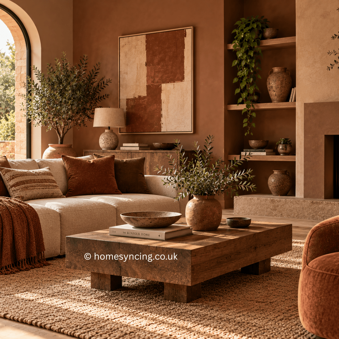
Give your walls a fresh coat of paint in a muted terracotta, sun-dried ochre, or soft clay tone. These create a dramatic yet comforting backdrop that instantly sets the mood.

Tip: Pair your baked earth walls with natural white or cream trims for a balanced contrast that maintains an airy feel.

2. Mix with Natural Materials

Furnish your space with materials that complement an earthy palette. A rattan chair, a weathered oak coffee table or linen curtains will help you build a cohesive, eco-friendly look.

3. Play with Textures

Texture is the key to stopping earthy tones from feeling flat. Add organic jute rugs, handwoven cotton throws or ceramic pots for depth and interest.

Imagine the joy of sitting on a plush terracotta sofa, your feet resting on a clay-coloured rug, surrounded by soft linen cushions.

4. Statement Artwork and Accents

Brighten your walls with statement artwork that incorporates baked earth tones, or use ceramics and vases in similar hues to tie the room together.

Tip: Vintage or handmade accessories have charm and authenticity, reinforcing the grounded, natural feel of your space.

5. Layer with Plants

What better way to celebrate nature than with lush greenery? Add an air-cleansing monstera or trailing pothos to complement the sandy pinks and golden ochres of your room.

6. Create an Accent Nook

Not ready to transform an entire room? Dedicate one corner—perhaps your reading nook or workspace—and decorate it in all-natural tones. A deep walnut desk or a rust-hued cushion can create a harmonious vibe in a small space.

The Future Is Natural

Baked earth colours aren’t just a trend—they’re an investment in a tranquil and enduring aesthetic that celebrates the beauty of the natural world. They allow you to reconnect with nature and create a sustainable sanctuary that reflects your values and personal style.

Are you ready to transform your home into the ultimate earthy retreat? Start small or renovate big—the possibilities are endless when working with colours as inspiring as nature itself.

Connect with Us to Learn More

If you’re ready to breathe new life into your home but need guidance in bringing these tones to life, our expert design consultants are here to help. Get in touch today and start reimagining your space.

Design your home with intention. Live with inspiration.

Further Reading: Interior Design Trends for 2025, Interior Design Trends for 2025 – Colour Drenching  .

For daily inspiration: Follow us on Instagram

Translate »